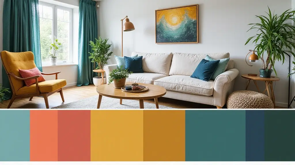
16 Bold Color Combinations That’ll Make Your Neighbors Jealous (W

When it comes to home decor, choosing the right color combinations can transform a dull space into a vibrant haven.
From bright blues and fiery reds to earthy greens and soft pastels, color can speak volumes about your personality and style. Whether you want to create a serene sanctuary or a lively gathering spot, the right hues set the tone for your everyday life.
In this guide, we’re showcasing 16 bold color combinations that not only reflect your unique taste but will also leave your neighbors green with envy. Get ready to unleash your creativity and make your home the talk of the block!
1. Coral and Teal: A Refreshing Twist
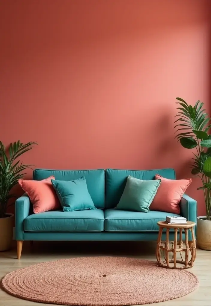
Coral and teal is a pairing that simply bursts with energy and warmth.
Imagine bright coral walls against a stunning teal sofa—this color combo brings a chic, beachy vibe into your home. Not only does it evoke memories of sun-kissed shores, but it also balances warmth and coolness, making your space feel inviting yet invigorating.
To pull this look off, consider accessories like throw pillows in various shades or artwork featuring both colors. Try adding natural elements like wood to ground the palette and select furniture that blends seamlessly into this radiant mix.
– Use coral as the primary color for walls, then choose teal for furniture or accents.
– Incorporate neutral shades like white or beige to soften the look.
– Opt for bold patterns in rugs or artwork that incorporates both colors for added dimension.
2. Navy and Mustard: A Classic Elegance
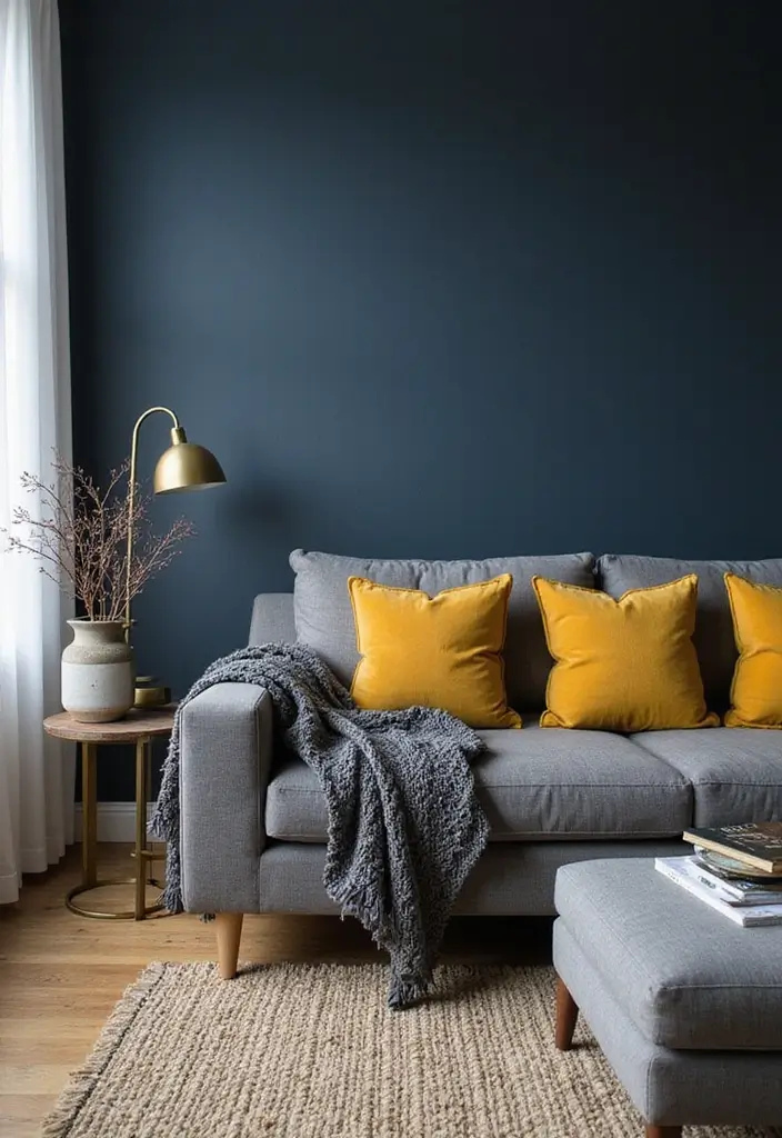
Navy and mustard is a combo that exudes sophistication and timeless charm.
These rich, deep shades work wonderfully together, creating a bold contrast that is visually striking. Picture a navy blue accent wall with mustard yellow cushions scattered across a sleek gray couch—it’s a foolproof way to uplift your living space!
This palette works best when you incorporate texture. Think about velvet curtains, a chunky knit throw, or a shag rug to add depth to your design. This combination also pairs beautifully with metallic accents; gold or brass finishes can act as the perfect complement, elevating the overall look.
– Use navy as the dominant shade, incorporating mustard in smaller doses for accents.
– Create balance with neutral tones like cream or beige to soften the boldness.
– Add layers through different fabrics and finishes for a dynamic feel.
3. Emerald Green and Blush Pink: Playful and Chic
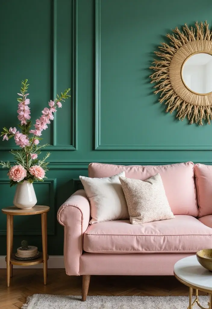
Emerald green and blush pink create a playful yet sophisticated atmosphere that can brighten any room.
This combination strikes the perfect balance between bold and soft; emerald provides a sense of richness while blush adds a gentle touch. Consider an emerald green feature wall paired with blush pink furniture or accessories—it’s a combo that can work in both modern and traditional settings!
To enhance this palette, add in elements like gold accents for a touch of luxury or natural woods for warmth. Fresh flowers in varying shades of pink can also breathe life into the space.
– Use emerald green as a statement color, incorporating blush as an accent.
– Introduce metallics like gold or copper for a luxurious feel.
– Play with different textures to keep the design interesting.
4. Gray and Peach: Soft Yet Striking
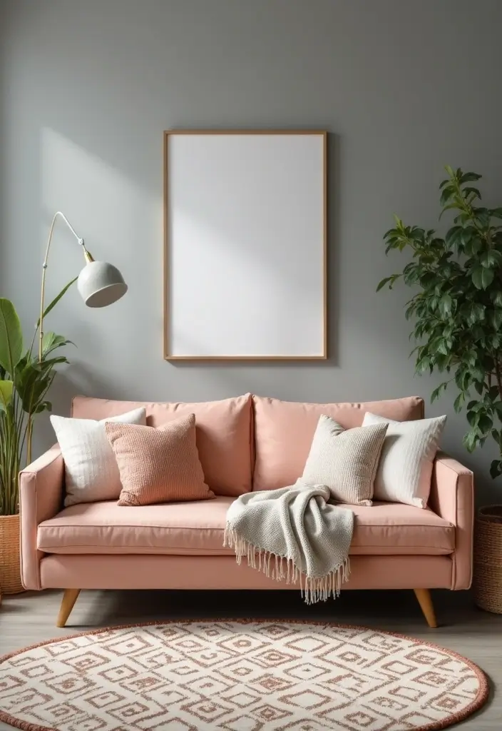
A soothing blend of gray and peach creates a soft yet striking backdrop for any home.
Gray offers a neutral foundation that’s versatile and contemporary, while peach adds a warm pop of color that’s inviting. Use gray for walls or larger furniture pieces, and let peach shine through in smaller accessories or artwork. The result is a subtle elegance that’s both relaxing and stylish.
To keep the palette fresh, incorporate elements like sage green plants or wooden accents to add some organic warmth. Patterns in textiles—like geometric shapes or florals—can also keep the design from feeling flat.
– Utilize different shades of gray for depth, using peach in decor items.
– Soft, textured textiles like throws or cushions can enhance the look.
– Add greenery to introduce life and freshness into the combo.
5. Black and Gold: Timeless Drama
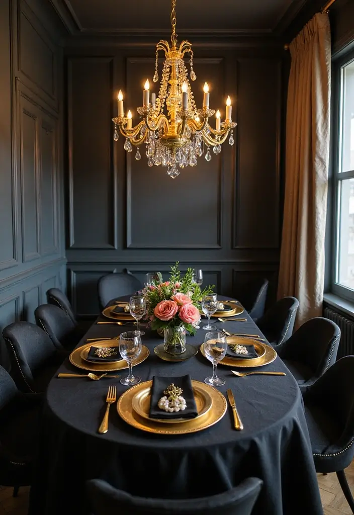
For those who enjoy a dramatic flair, black and gold is a classic pairing that never goes out of style.
Using black as a base color allows gold accents to truly pop, creating an air of sophistication. Imagine a sleek black dining table adorned with gold chargers and cutlery—it’s this kind of elegance that can elevate any room. To infuse personality, consider mixing in textures like velvet or satin to soften the starkness of black.
Lighting plays a crucial role here; a stunning gold chandelier against a black backdrop can serve as a breathtaking focal point.
– Use black for larger surfaces like walls or furniture, accentuating with gold in decor.
– Consider texture in fabrics—think velvet or silk to add richness.
– Choose statement lighting to enhance the drama.
6. Lavender and Sage: Calm and Cozy
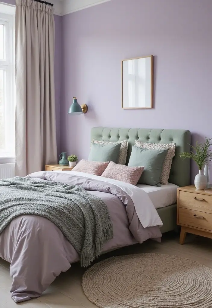
Lavender and sage is a tranquil duo that brings a sense of calm and coziness to your home.
The soft purples of lavender are revitalizing, while sage green evokes a connection with nature. Together, they create a soothing atmosphere that’s perfect for a bedroom or a reading nook. Use lavender for walls or larger pieces and introduce sage through plants or textiles.
Textures are essential in this palette; think about knitted throws or soft rugs that invite relaxation. To keep things fresh, incorporate white or light wood furniture to add brightness and contrast.
– Use lavender as a primary color, accentuating with sage for balance.
– Choose softer textures in linens and furnishings for coziness.
– Add pops of white to brighten the palette.
7. Turquoise and Orange: Vibrant and Fun
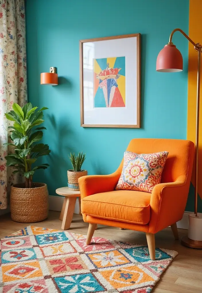
For the brave at heart, turquoise and orange scream vibrancy and fun!
This energetic color combination is perfect for kids’ rooms, game rooms, or any space where creativity flows. Picture a turquoise accent wall with bright orange furniture and playful artwork—it’s a combination that inspires joy and excitement. Use bold patterns in rugs or curtains to tie the look together.
Incorporate natural elements like plants to soften the bright colors, or balance with neutral fixtures. This combo thrives on playful decor, so don’t be afraid to mix and match patterns!
– Use turquoise as a bold base, adding orange in accent pieces.
– Consider patterned textiles to add fun to the design.
– Integrate greenery to provide a natural touch.
Dare to be bold! Turquoise and orange bring vibrant energy to any space, sparking creativity and joy. Transform your home into a playful oasis where every corner inspires fun!
8. Fuchsia and Lime: For the Fearless
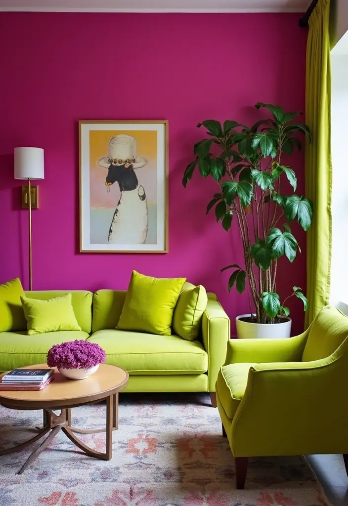
Fuchsia and lime is not for the faint-hearted, but it sure makes a statement!
This daring duo transforms any space into an explosion of personality. Think fuchsia walls paired with lime green furniture or decor—it’s boldness at its finest! The key to making this work is to balance the intensity with neutral tones or lighter elements. Consider incorporating metallics or even black to create contrast and depth.
Perfect for spaces meant for socializing or creatives, this color scheme is all about self-expression!
– Use fuchsia for a statement wall, complementing with lime in smaller decor items.
– Balance with whites or muted tones to soften the vibrancy.
– Don’t shy away from unique patterns in textiles to enhance the energy.
9. Chocolate Brown and Cream: Rich and Inviting
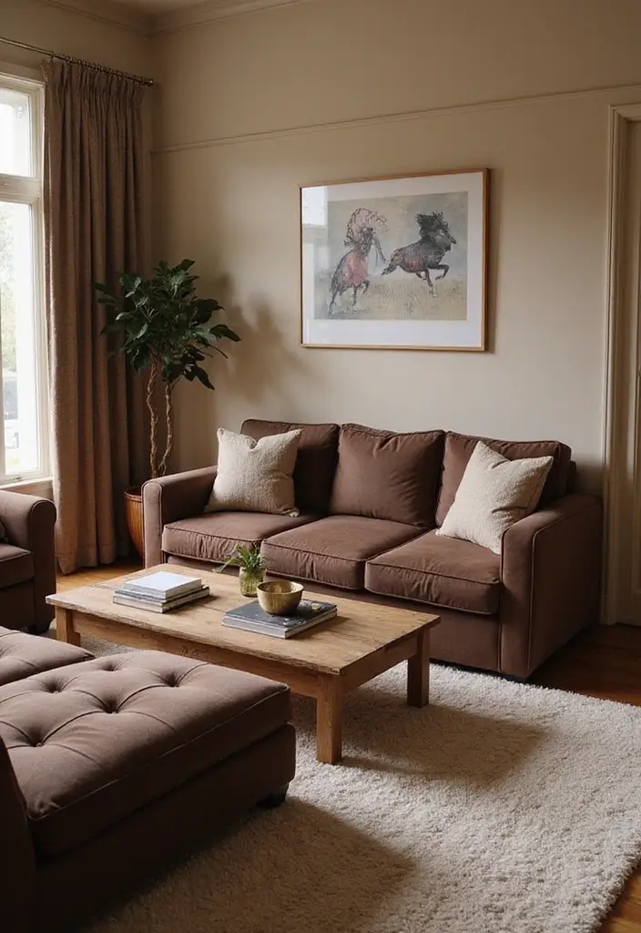
Chocolate brown and cream is the ultimate combination for creating a rich and inviting atmosphere.
This duo is perfect for a warm and cozy environment, reminiscent of a classic coffee shop. Imagine deep brown furniture complemented by creamy walls and accessories; the result is a comforting and timeless look. To enhance the vibe, incorporate textures like soft fabrics and warm woods.
Adding elements of gold or bronze can elevate the richness of the palette while maintaining its inviting nature. Consider layering rugs or throws for added warmth.
– Use chocolate brown as the main color for larger pieces, including cream in decor items.
– Layer textures to create a cozy feel.
– Introduce metallics to add a touch of elegance.
10. Ruby Red and Beige: A Timeless Contrast
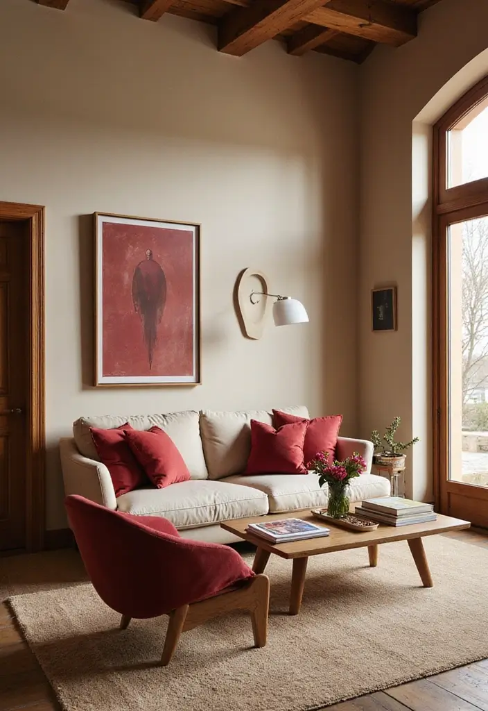
Ruby red and beige is a classic pairing that showcases elegance and warmth.
Think ruby red accents against a soft beige backdrop—this timeless combo is perfect for living rooms or dining areas. The richness of ruby creates an inviting space, while beige keeps it grounded and cozy. Accessories like cushions, artwork, or even a bold rug can add splashes of ruby without overwhelming the room.
Mixing in wood tones can bring in natural elements, while gold or silver accents can elevate the overall aesthetic.
– Use beige for walls or larger furniture pieces, accentuating with ruby in smaller decor items.
– Combine textures to maintain visual interest.
– Consider natural wood for a warm touch.
11. Charcoal and Mint: A Balanced Duo
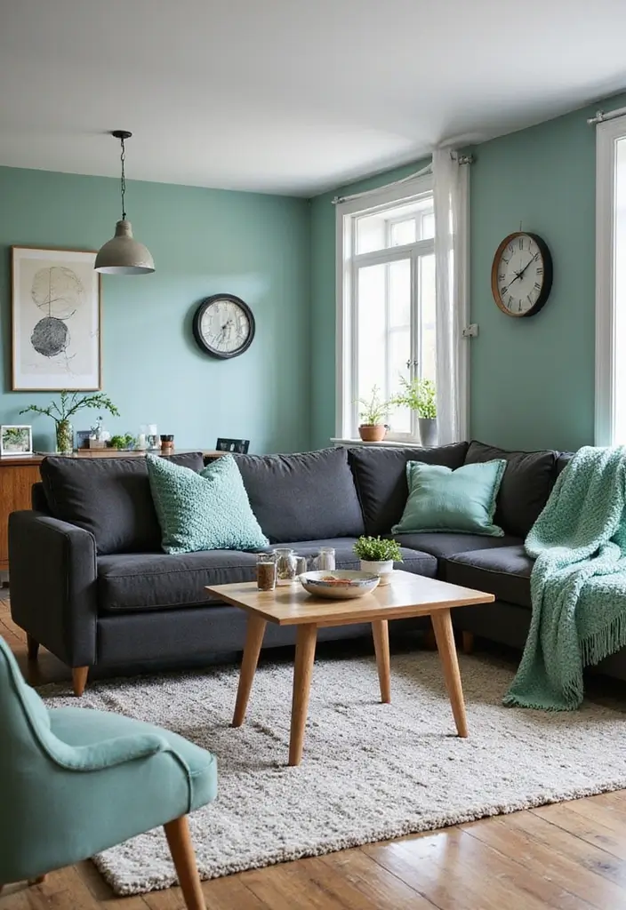
Charcoal and mint is a fresh twist on a minimalist palette, offering depth without overwhelming the senses.
Charcoal provides a strong foundation, while mint lightens the mood, creating a balanced and harmonious vibe. Use charcoal for larger pieces, like furniture or accent walls, and mint for accessories or smaller decor items.
To keep it grounded, consider wooden elements or metallic accents that can add warmth and sophistication. Textured items like knitted throws and rugs can enhance the cozy atmosphere.
– Use charcoal for striking contrast, introducing mint for a lighter touch.
– Layer different textures in textiles for visual interest.
– Incorporate natural elements to soften the palette.
Charcoal and mint create a serene space that balances boldness with calm. Anchor your decor with charcoal’s strength, and let mint add a refreshing touch! Perfect for a stylish yet inviting home.
12. Cobalt Blue and White: Crisp and Clean
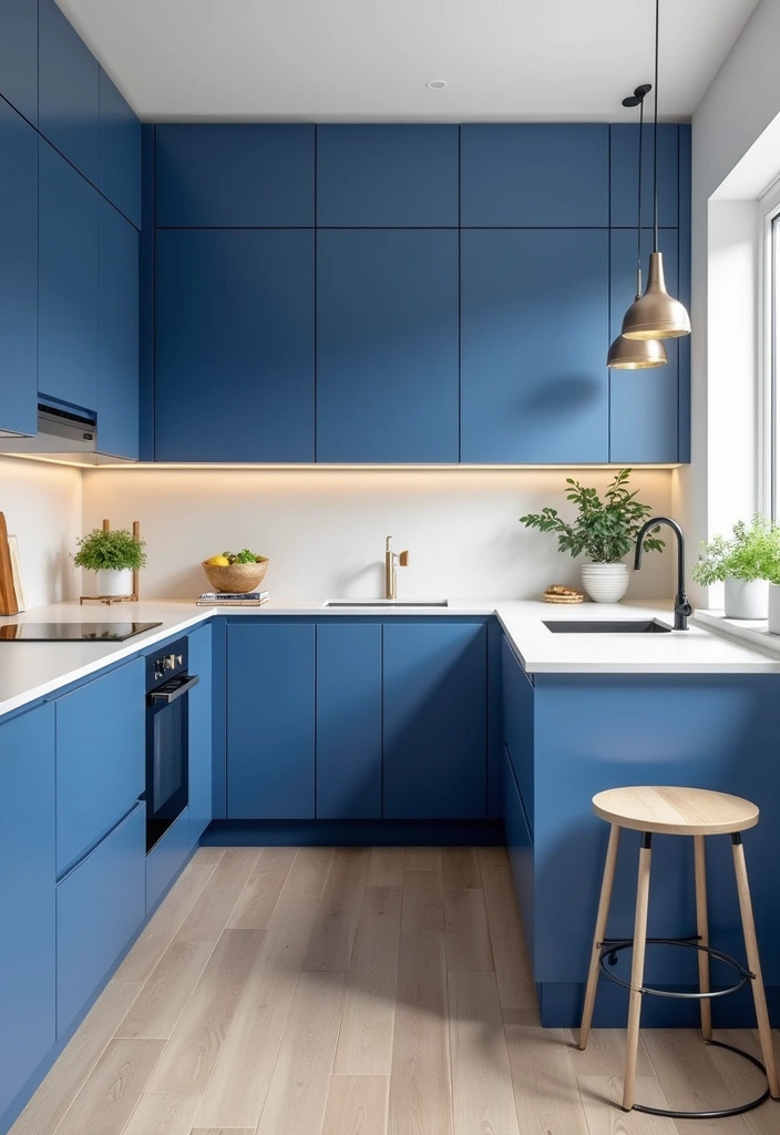
Cobalt blue and white create a crisp and clean aesthetic that is both fresh and timeless.
The vibrant cobalt offers a striking contrast against the purity of white, making it a fabulous choice for kitchens and bathrooms. Imagine cobalt blue cabinets with white countertops, or a stunning blue accent wall paired with white decor—it’s a combo that brings energy and clarity to any room.
To maintain a clean look, incorporate sleek lines in furniture and keep accessories minimal. Adding a few natural elements, like plants or wooden accents, can help soften the sharpness.
– Use cobalt blue as a statement color in fixtures or furniture, balancing with white in the decor.
– Keep lines sleek and simple for a modern feel.
– Integrate greenery for a fresh touch.
Crisp and clean, cobalt blue and white bring a fresh energy to your home. Embrace this timeless combo for kitchens and bathrooms, and let simplicity shine through with sleek lines and minimal accessories!
13. Burnt Orange and Dark Blue: Rustic Charm
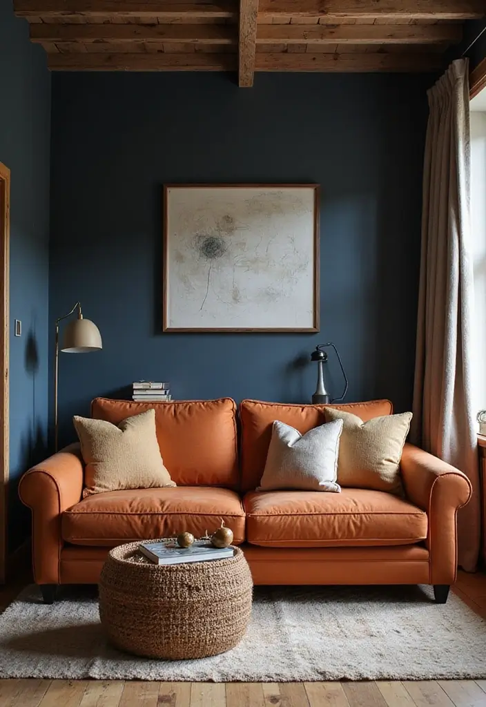
Burnt orange and dark blue form a rustic, charming combination that evokes feelings of warmth and comfort.
The rich, earthy tones are perfect for creating a cozy gathering space, whether it’s a living room or a den. Picture dark blue walls contrasted with burnt orange sofas and cozy throws; this color scheme is inviting and timeless. To add warmth, consider natural wood accents and textured fabrics that enhance the rustic vibe.
Art and decor pieces that incorporate both colors can tie the room together beautifully.
– Use dark blue for walls, integrating burnt orange in furniture and decor items.
– Choose natural materials like wood to enhance warmth.
– Incorporate layered textiles for added texture.
14. Periwinkle and Yellow: Cheerful and Light
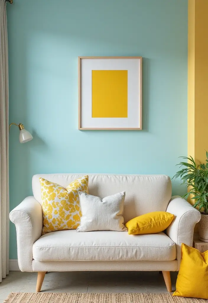
Periwinkle and yellow create a cheerful and light-hearted atmosphere perfect for any space.
This combination is refreshing and inviting, with periwinkle providing a soft backdrop for the sunny brightness of yellow. Consider using periwinkle for walls or major furniture pieces, while introducing yellow through accents like cushions, artwork, or a statement chair.
To maintain a light feel, incorporate white or soft neutrals that can provide contrast without being overpowering. Playful patterns in textiles can enhance the cheerful vibe.
– Use periwinkle as a base color, accenting with yellow for a pop.
– Introduce soft neutrals to balance the palette.
– Patterns in fabrics can add fun and dynamism.
Brighten your home with periwinkle and yellow! This cheerful combo invites happiness while keeping things light and fresh – perfect for creating an uplifting atmosphere that you’ll love coming home to.
15. Olive Green and Rust: Earthy and Warm
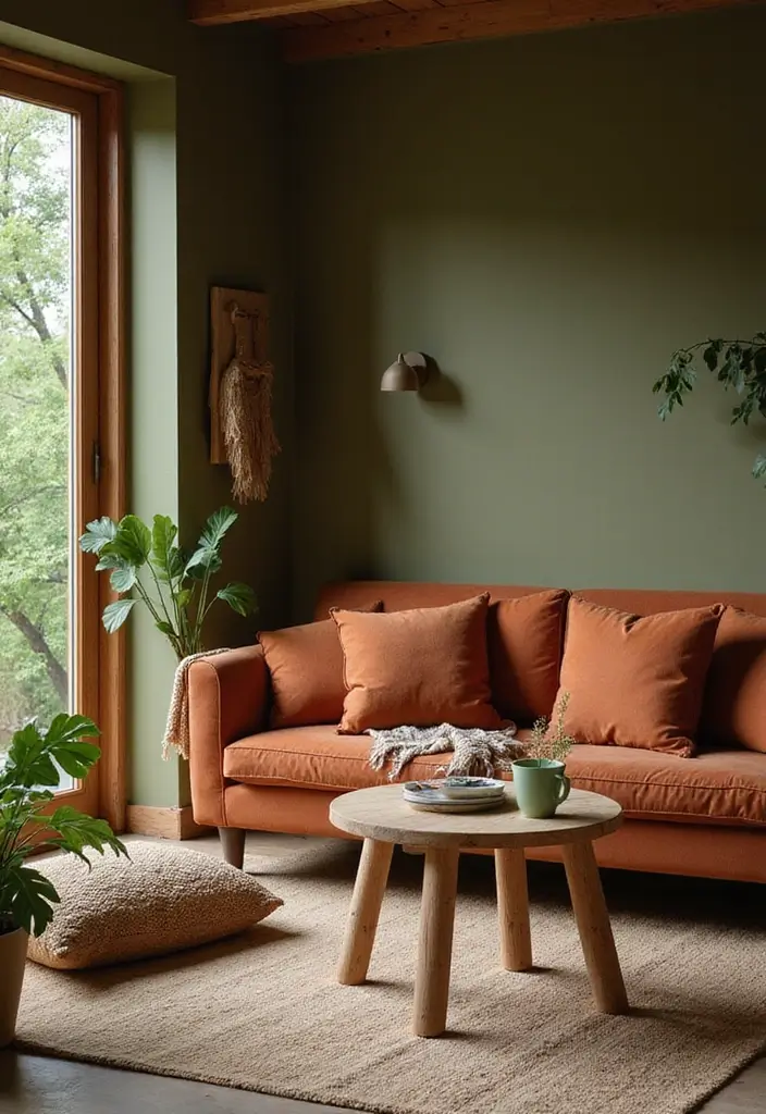
Olive green and rust create an earthy and warm color palette that feels wonderfully grounded.
This combination is perfect for spaces that embrace a natural vibe, and it’s great for those who love a more muted yet rich aesthetic. Picture olive green walls contrasted with rust-colored furnishings or decor—it’s a pairing that invites comfort and tranquility. To enhance the warmth, consider wooden accents and textiles in soft weaves.
Incorporating elements like plants can breathe life into this palette, making it feel even more connected to nature.
– Use olive green as the primary color and rust as an accent.
– Incorporate natural materials for warmth.
– Add greenery for an organic touch.
16. Aqua and Charcoal: A Modern Affair
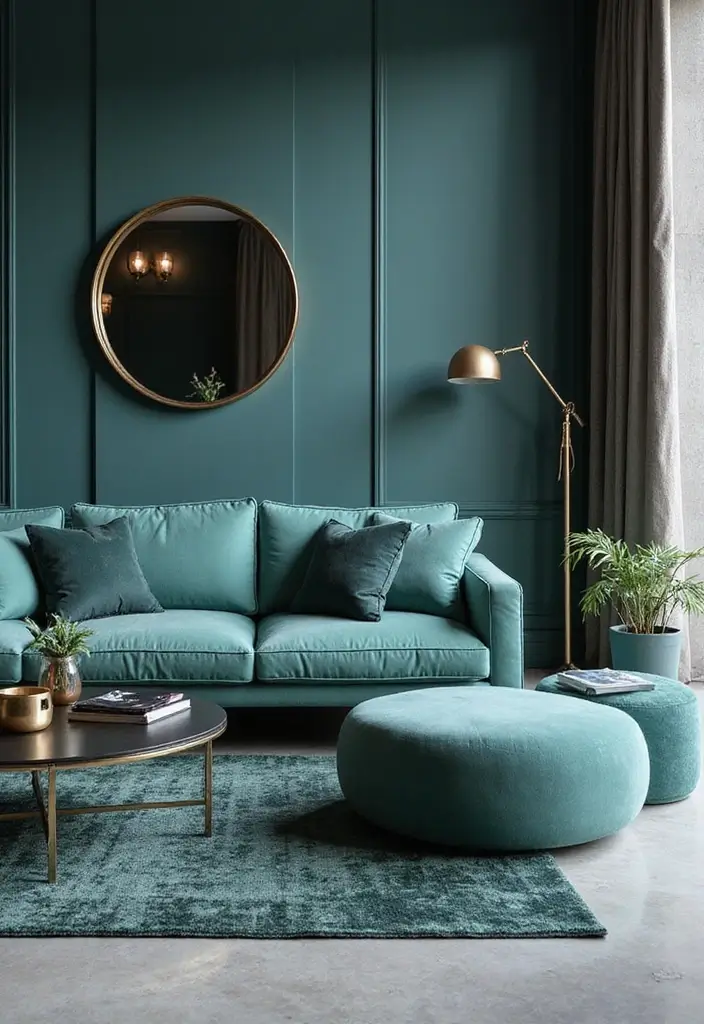
Aqua and charcoal create an attractive modern affair that’s ideal for contemporary spaces.
Aqua offers a refreshing pop of color that can energize a room, while charcoal provides a strong, sophisticated base. This combo is perfect for a home office or a sleek living area—imagine a charcoal sofa adorned with aqua cushions and decorative elements. To keep it modern, choose clean lines in your furniture and decor, and incorporate metallics for a touch of glam.
Textures, like soft throws or geometric patterns, can add depth and interest to this stylish palette.
– Use charcoal for larger furniture pieces, integrating aqua in accessories.
– Incorporate metallic accents for a modern touch.
– Textured elements can enhance the design’s appeal.
Conclusion
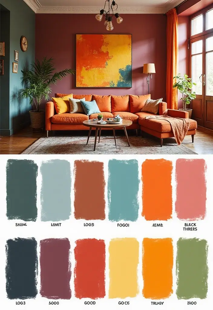
Daring to embrace bold color combinations can transform your home into a vibrant and personal sanctuary.
From refreshing coral and teal to the fearless fuchsia and lime, these palettes provide endless possibilities for self-expression. Remember, the key to successful color layering is balance and texture, which can elevate your designs from ordinary to extraordinary.
So, which combination will you choose to make your neighbors jealous?
Frequently Asked Questions
What are some tips for choosing the right bold color combinations for my home?
Choosing the right bold color combinations can be a fun journey! Start by considering the mood you want to create in each room. For example, vibrant colors like turquoise and orange can energize a space, while softer pairs like lavender and sage evoke calmness.
Don’t forget to test paint samples in your home’s lighting to see how different shades interact throughout the day. Also, consider using accessories in bold colors to add pops of vibrancy without overwhelming the space.
How can I incorporate bold color combinations without overwhelming my space?
Great question! To incorporate bold color combinations without overwhelming your space, try starting with a neutral base. This allows bold colors to shine without competing for attention. Use vibrant colors in smaller areas, such as accent walls, furniture, or decor items.
Another tip is to balance bold colors with textured elements like wood or metal to create harmony. And remember, it’s all about finding a balance that feels right for you!
Are there specific color combinations that work best in smaller spaces?
Absolutely! In smaller spaces, lighter and brighter color combinations tend to work wonders. For instance, light gray and peach can create an inviting atmosphere without making the room feel cramped. Additionally, combinations like cobalt blue and white can give a fresh and clean look while also making the space appear larger.
Don’t shy away from bold colors altogether, but use them in accents to maintain a roomy feel!
What are some bold color combinations that are trending in home decor right now?
Currently, some of the hottest trends in bold color combinations include emerald green and blush pink for a sophisticated yet playful vibe, and burnt orange and dark blue for a rustic charm. Another exciting trend is the pairing of fuchsia and lime, which is perfect for those looking to make a striking statement.
Keep an eye on your favorite design magazines and social media for even more inspiration!
How can I use color combinations to enhance my home’s curb appeal?
Enhancing your home’s curb appeal through color combinations is all about making a memorable first impression! Start with a bold front door color like navy or red against a lighter exterior. Pair it with contrasting window shutters or planters to create visual interest.
Consider using plants and landscaping in complementary colors to tie everything together. This not only boosts your home’s curb appeal but also reflects your personal style!

